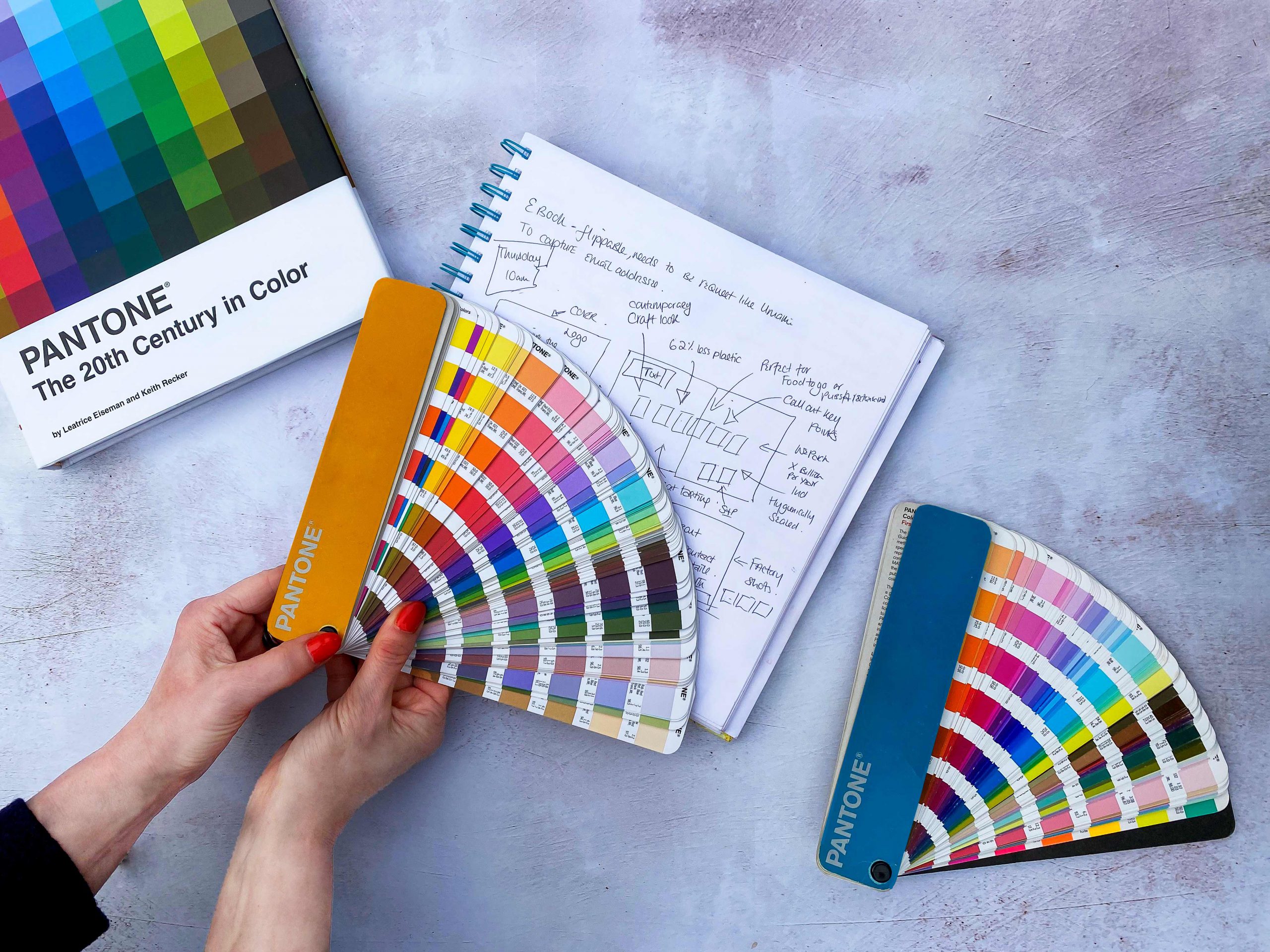
We live life In colour every day. It’s literally everywhere. But when you start to study colour and what it means, you start to really notice it, and it’s impact, so much more.
It’s amazing how colour changes your mood, whether it’s clothes, book covers, home décor or food packaging design, every colour has a place and purpose.
Are you warm and friendly, challenging and disruptive, calm in a sea of confusion, green and earthy. It’s so much more than just your favourite colour, it’s your why and how you want others to feel.
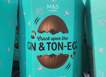
We chose the rich red for the Umami branding based on food, we call it ripe tomato red. Ripe tomatoes ooze umami, the fifth sense of taste and so it made sense to align ourselves for that reason. We also like red!
Choosing red is not a simple choice, too bright and light and it can look arrogant and challenging. Red represents danger and fire, but also love and passion. It is can also make you think of drama and importance. Think about celebrities walking down a red carpet. It’s never grey or beige is it? It’s drawing your eye’s attention.
Go too light in red and you can almost end up in pink, interestingly pink and the right red clash beautifully. Red is energetic and passionate, can represent success and prosperity, or danger and fear.
But, darker shades of red are often considered bold, powerful and elegant. The Umami red is C:0 M:90 Y:85 K:9, and when we just went through preparing for our own new website we had many discussions about whether we should update the colour. In the end we stayed with our ripe tomato red, it feels right, showcases our services well, and we love ripe tomatoes to look at and eat!
Colour says so much. If you’re thinking of changing your logo, your brand identity or packaging design, please take deep consideration of the colours you choose. We love to talk all things colour and design, why not talk it through with our team. You’ll always get an honest discussion, based on decades of experience in the food and design industry.
Just don’t ask Michelle about why “blue is not a food colour, unless it’s fish or frozen”. It’s a long story…another blog entirely.
We ❤️ colour. It’s a huge part of our every day in a design and marketing agency. Curious about how it works for your food business? Get in touch to talk to the team.